Here is the link for the prototype
Student Project at Career Foundry
DIY, Design
From user research to Product design from conception to visualization
4 months
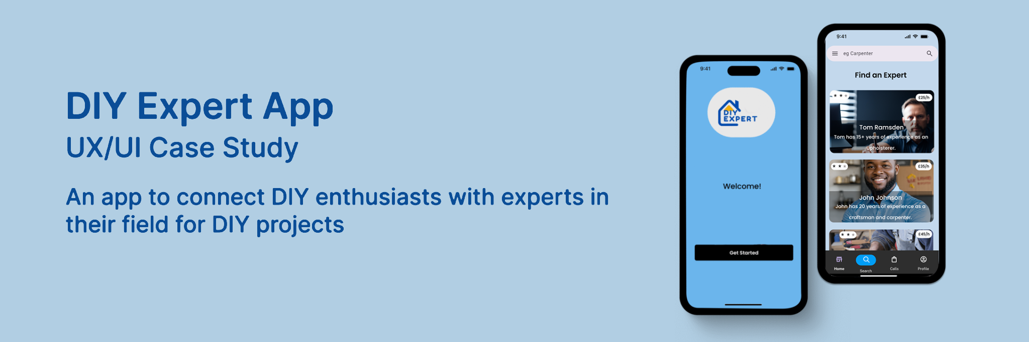
A DIY app which will be able to solve the day to day problems people have in their homes with their DIY projects. It is an app to get expert help on DIY projects which you would like to venture into on your own and would like some help along the way. It is an easier way to get help on projects around the house and outdoors which you would like expert help on without paying the huge price tags to get a professional to do the job for you.
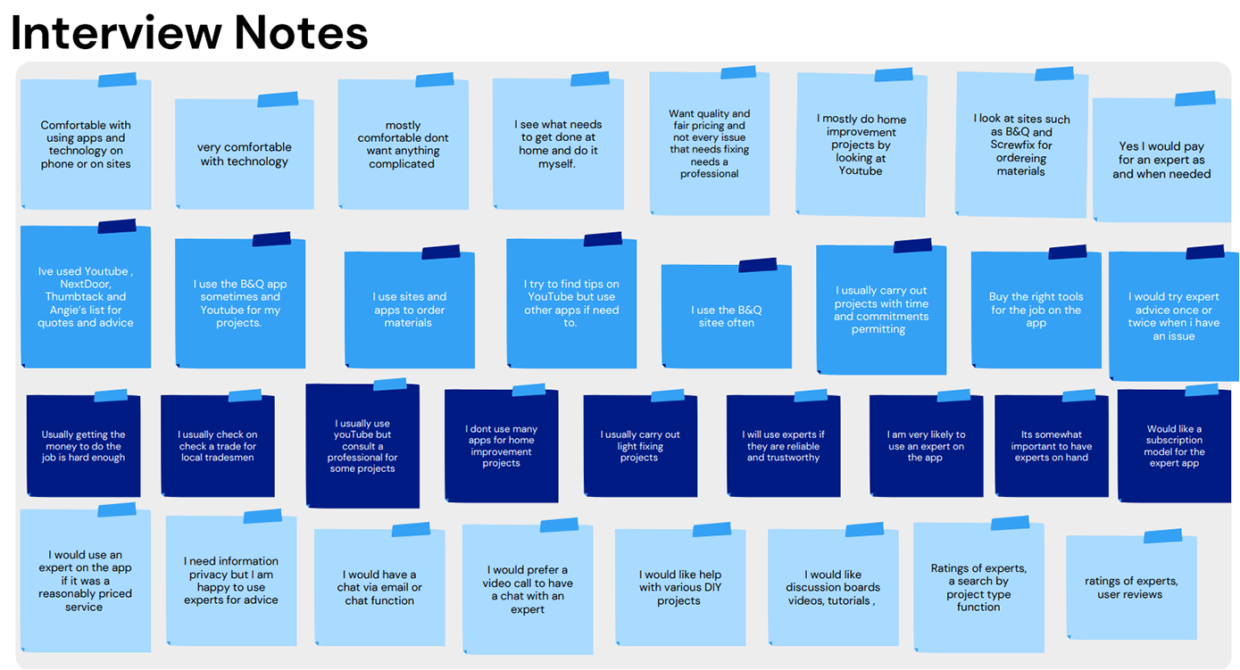
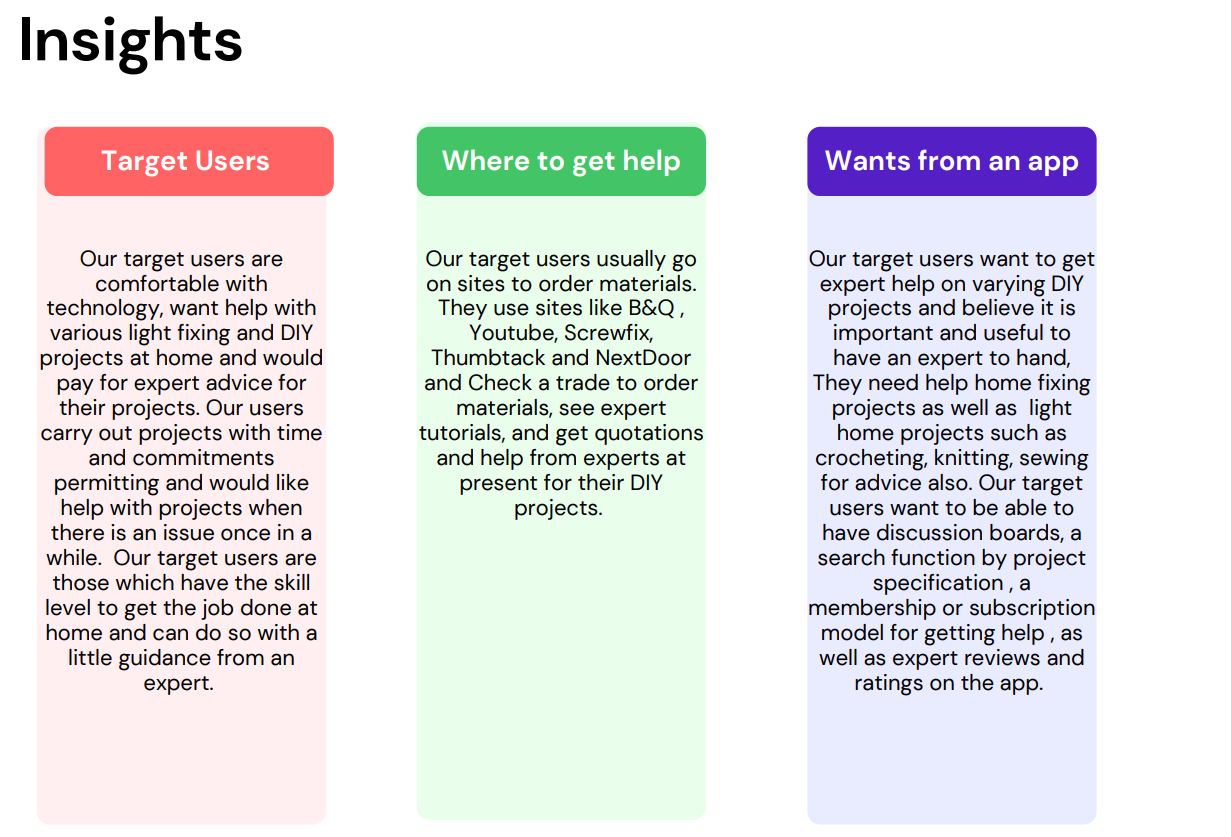
Here is how I went about testing my initial problem statement and hypothesis. I first highlighted the Functional Requirements and Research Goals as below. And then I interviewed potential users to see what they would like in an app, what their current use of technology was, what kind of apps they currently use if they would like to do some DIY projects and I gathered the interview notes and sorted them into 3 main categories.
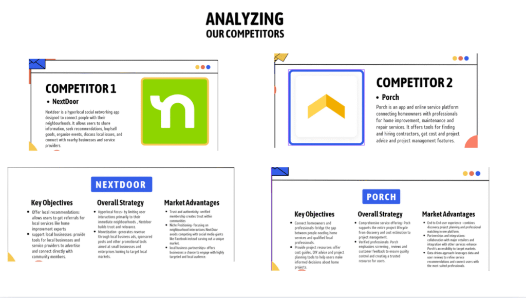
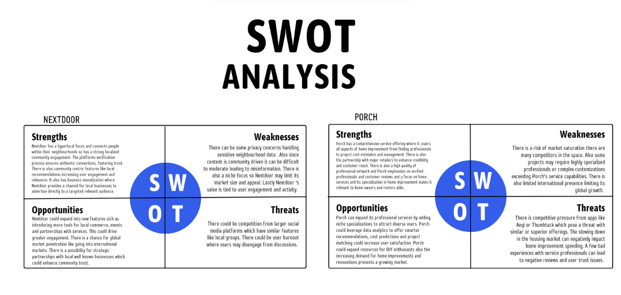
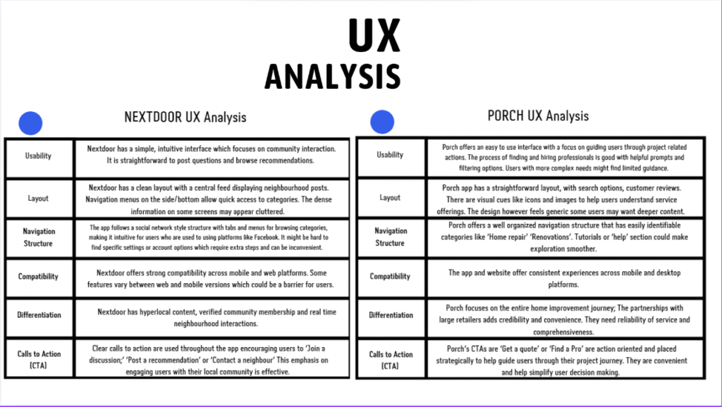
I went about doing a Competitor Analysis, and a UX Analysis as well as a SWOT analysis of the main competitors of DIY apps out there.
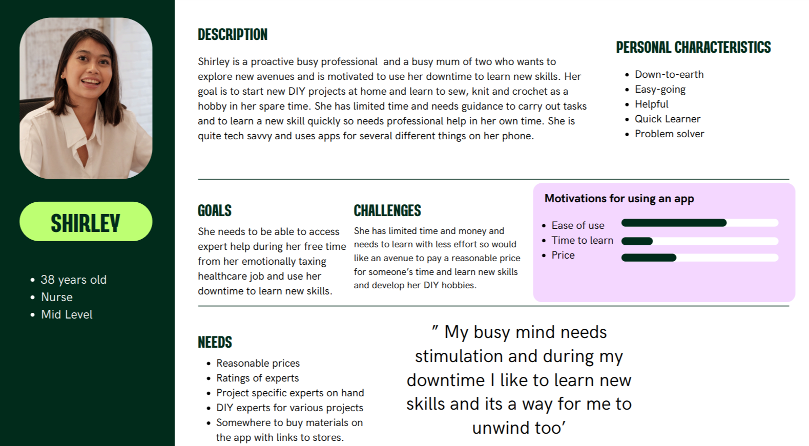
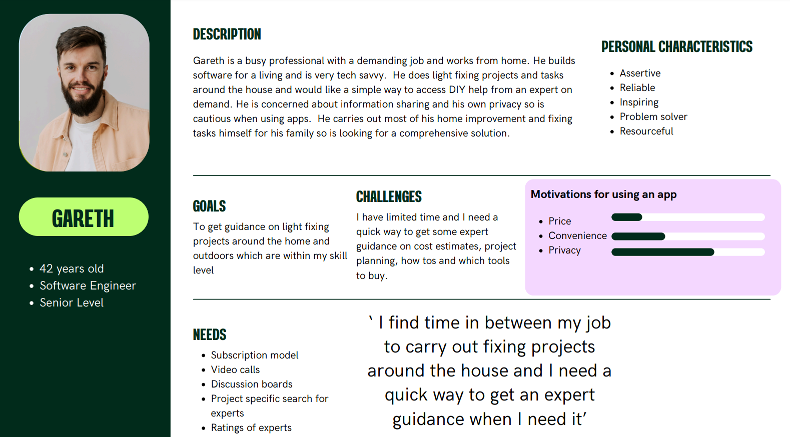
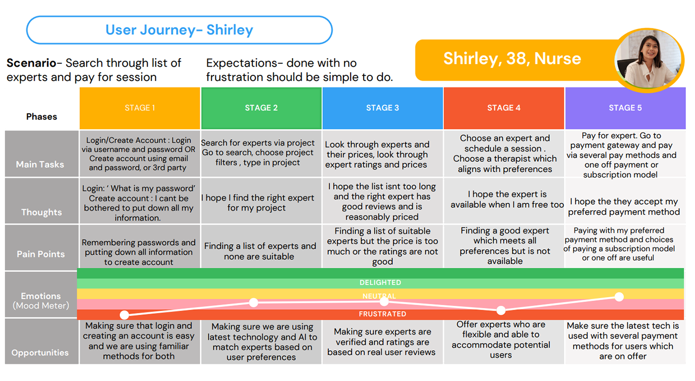
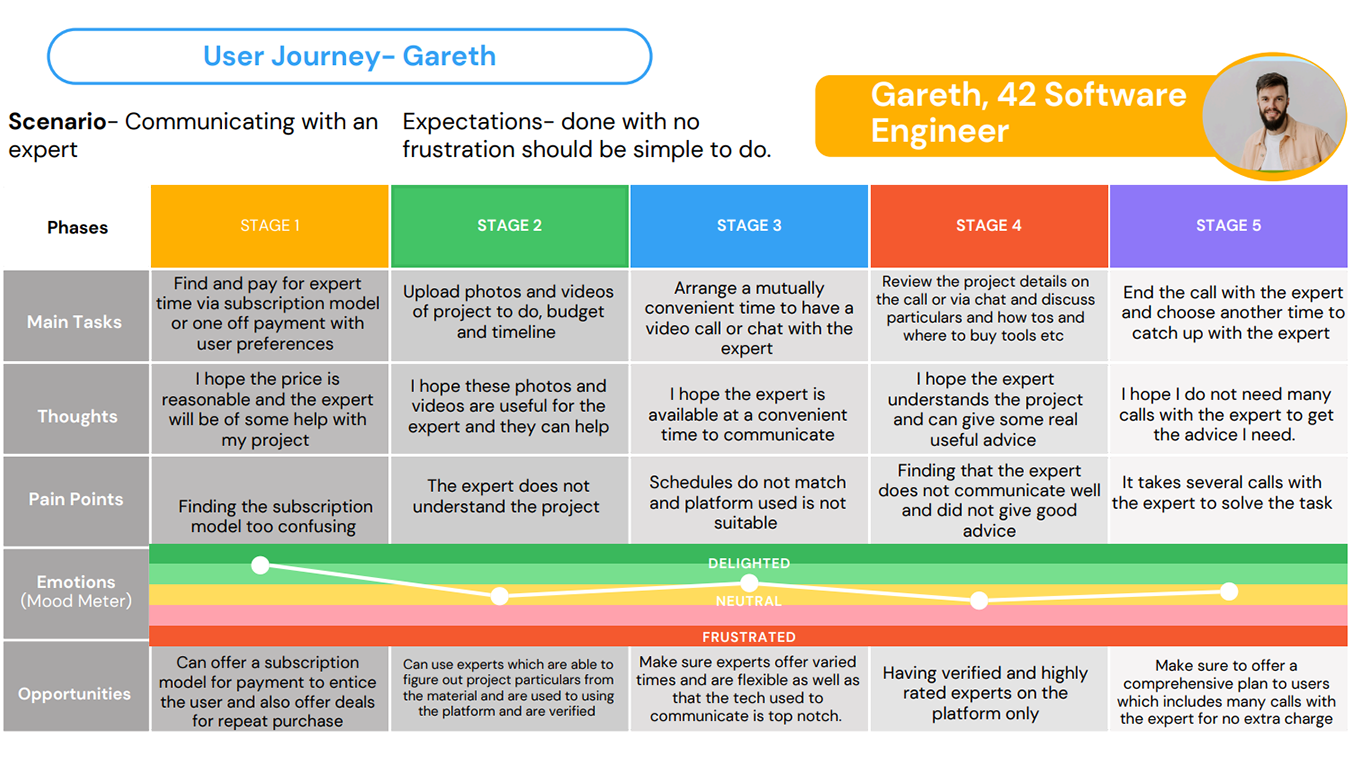
I then compiled some user personas to help with the vision of what kind of user the potential user for the product would be and I came up with 2 main personas.
I then compiled some user journeys for each persona and user flows for what kind of path the user will follow to achieve tasks on the app.
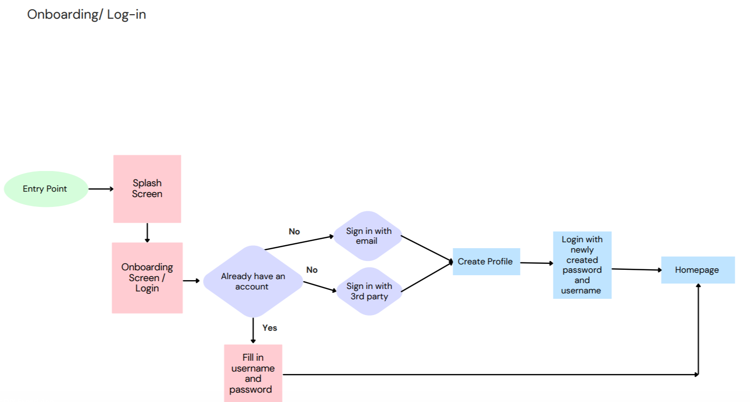
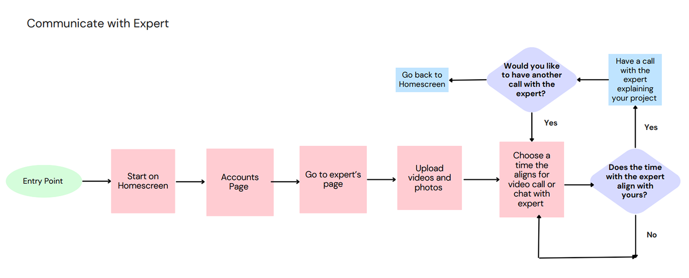
I then drew up some user flows for the Onboarding/Log in, Pay for the expert, and Communicating with the expert function. The user flows highlighted the journey people would take to get from A -> B and go through to complete the task of loggin in or paying for an expert.
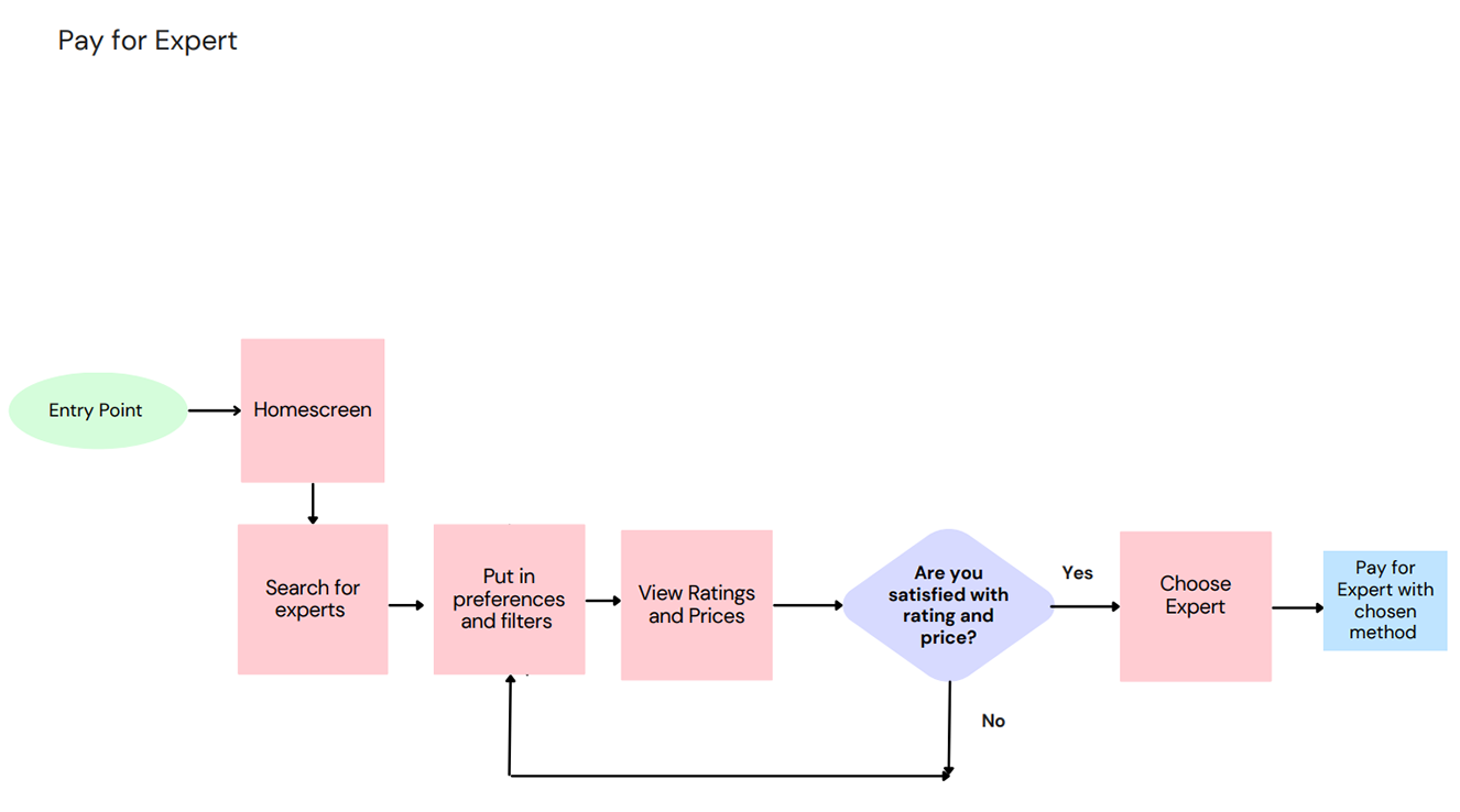
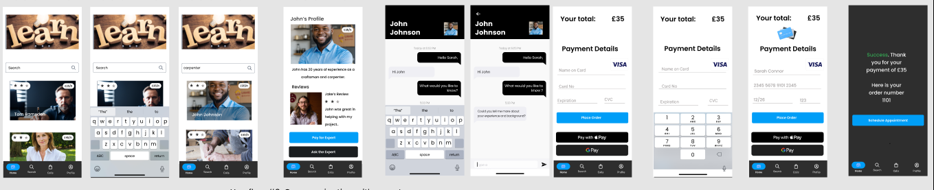
I then created low fidelity , mid fidelity and high fidelity prototypes with the user flows. Here is the pay for expert user flow in high fidelity mockup.
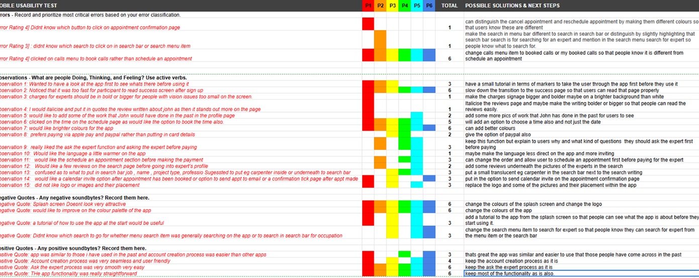
I then did some rounds of usability testing with potential users in the form of testing out the prototype and doing in depth interviews with 6 users who gave me really valuable feedback and with which I refined my prototype further.
#2 Usability Test Report
Test report introduction
Issue 1: clicked on calls menu to book calls rather than schedule an appointment
Suggested Change: changed the menu item to bookings instead of calls so that users do not get confused.
Evidence: 6 participants felt the calls menu item on navigation was confusing.
Issue 2: Noticed that it was too fast for participant to read success screen after sign up
Suggested Change: changed the transition to 1.5s delay before going to the search /home page.
Evidence: 6 participants did not get the chance to read the success page after they had logged on/ signed up before it transitioned to the search/ home page.
Issue 3: would like brighter colours for the app
Suggested Change: changed the colour palette to suit the user.
Evidence: 6 participants did not like the colours for the app
Issue 4: Didnt know which search to go for whether menu search item was generally searching on the app or to search in search bar for occupation
Suggested Change: changed the menu item to expert search so that people understood what to search for.
Evidence: 3 participants did not know what the search on menu item was for.
Issue 5: confused as to what to put in search bar job, name, project type, profession
Suggested Change: added eg carpenter in the search bar next to the search writing so that people know what to search for.
Evidence: 3 participants did not know what to search for in the search bar.
Issue 6: people would like to select the time also whilst scheduling Suggested Change: added time picker for users to choose the time Evidence:5 participants wanted to choose time also as well as the date
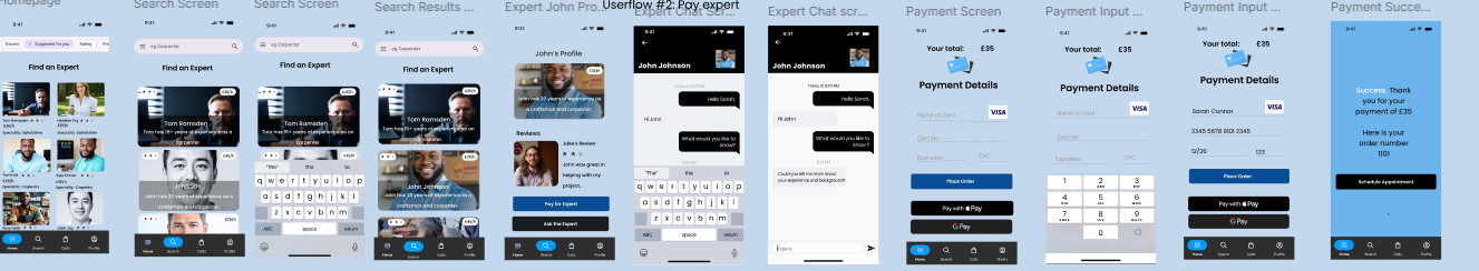
Here is the refined prototype with some more tweaks and more additions. Here is the pay for expert user flow.
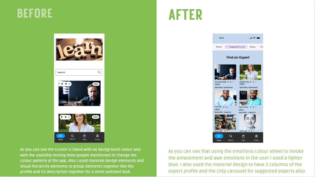
There was also a round of peer reviews whereby my peers gave me feedback on my prototype and I made some more improvements on the screens. For example the homescreen did not look correct and I made the decision to use material design elements to put two columns of expert profiles rather than one profile and use visual hierarchy elements to have the description of the experts underneath their profile pictures alongwith their star ratings. I added a chip carousel with suggested experts by category at the top of the screen and with peer reviews someone suggested I put the IPhone battery and time elements at the top of the screen also which I duly did. The visual of the home screen looks better with the changed colours and the design elements more neatly arranged on the page. I also mentioned find an expert at the top of the improved screen so that the user is aware they can use the chip carousel to go to suggested experts by category.