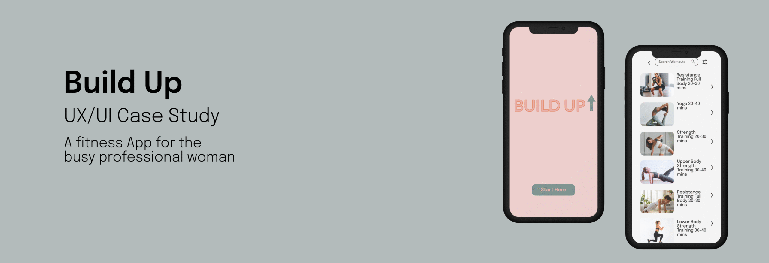
Build Up is a sleek, empowering fitness app crafted for busy professional women who are short on time but big on goals.
Designed with intuitive UX and elegant UI, the app provides personalised, time-efficient workouts that seamlessly fit into a demanding schedule- whether a 10-minute power session between meetings or a 30-minute wind down after work.
The design focuses on minimal distractions, clean navigation, and motivational visuals, allowing users to set goals, track progress, and access guided workouts anywhere, anytime.
Overview
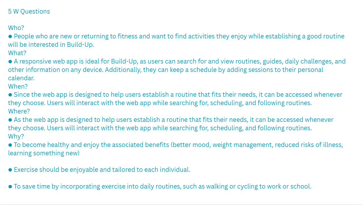
The Problem
Finding exercise routines for your level can be difficult, especially if you want to try something new. This responsive web app aims to help people get into an exercise of their choice by holding their hand and providing routines, guides, interactive examples, and information. Secondly, finding routines that fit into your schedule is not easy. The web app is designed to encourage people who want to get into an easy routine for physical activities. This means fitting in as little as a 5-minute routine.
This design challenge set the foundation for Build-Up. I set out to create an experience that not only delivered functionality but felt approachable to users.
What is Build-up?
Build-up is a responsive web app designed to help professional women fit in their workouts into their busy schedules. The app simplifies finding a workout with smart filters and a clean UI.
Throughout this project, my focus was on creating a solution that aligned with the behaviour of mobile-first users and empowered them to explore workouts without friction.
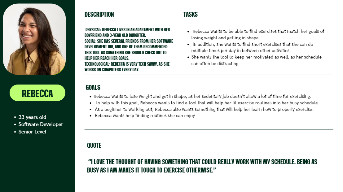
User Persona
Understanding Rebecca’s goals as highlighted below guided the overall UI design.
● Rebecca wants to lose weight and get in shape, as her sedentary job doesn’t allow a lot of time for exercising. ● To help with this goal, Rebecca wants to find a tool that will help her fit exercise routines into her busy schedule. ● As a beginner to working out, Rebecca also wants something that will help her learn how to properly exercise. ● Rebecca wants help finding routines she can enjoy.
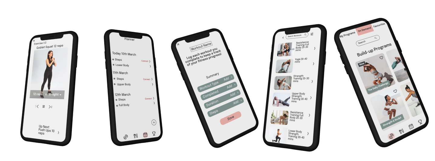
With mobile-first layouts and simplified navigation as well as visual hierarchy that helps users like Rebecca search workouts to fit in during their busy schedules.
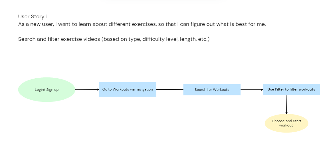
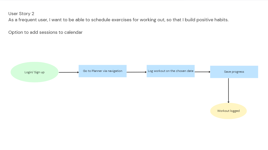
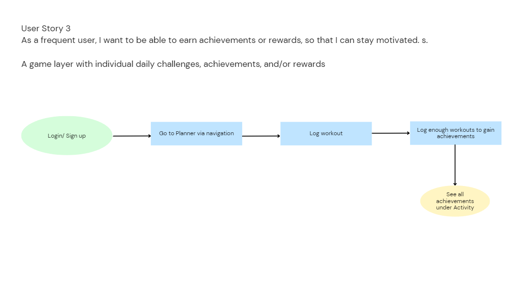
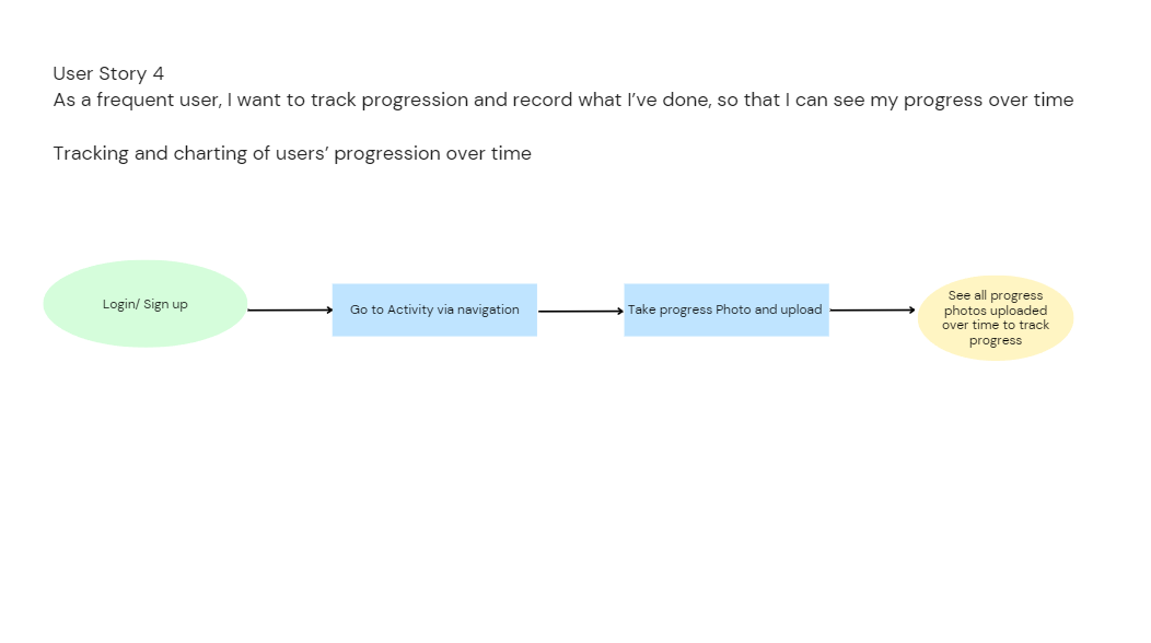
User Stories and User Flows
These user stories translated direction into features and UI decisions. Every screen was built to support one or more of Rebecca’s needs.
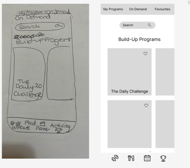
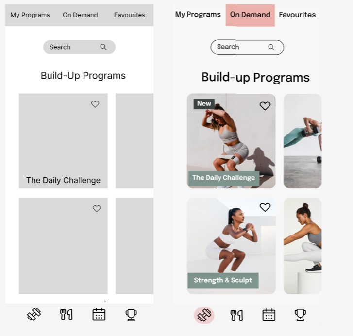
Lo Fidelity to Mid-Fidelity Wireframes
Mid-Fidelity to High Fidelity Wireframes
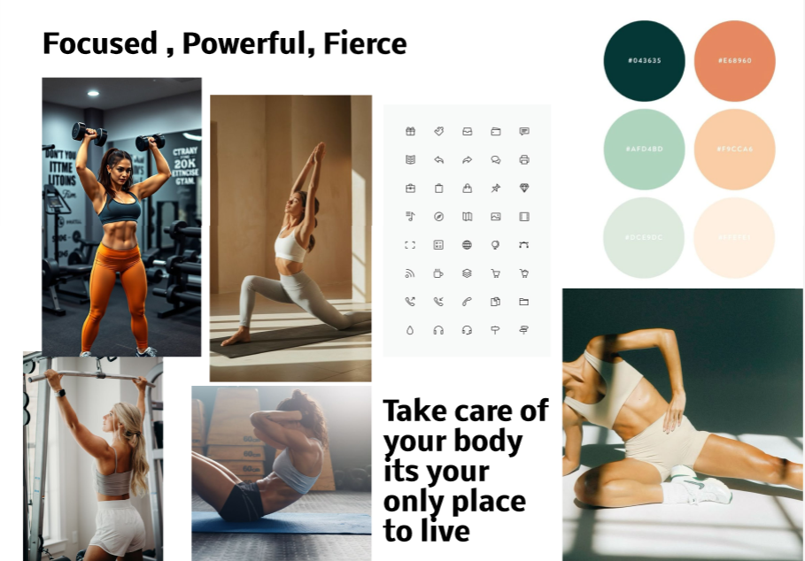
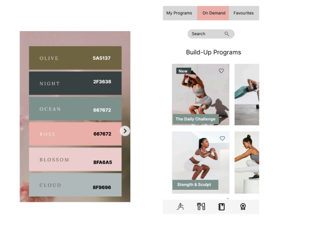
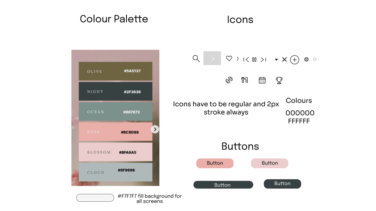
MoodBoard and Colour Palette
MoodBoard Initially for the Build Up App which I had chosen was not the same colour palette that I had chosen for the app itself but it is a visual representation of what I wanted out of the app and very close to the feel of the app itself which was chosen in the end.
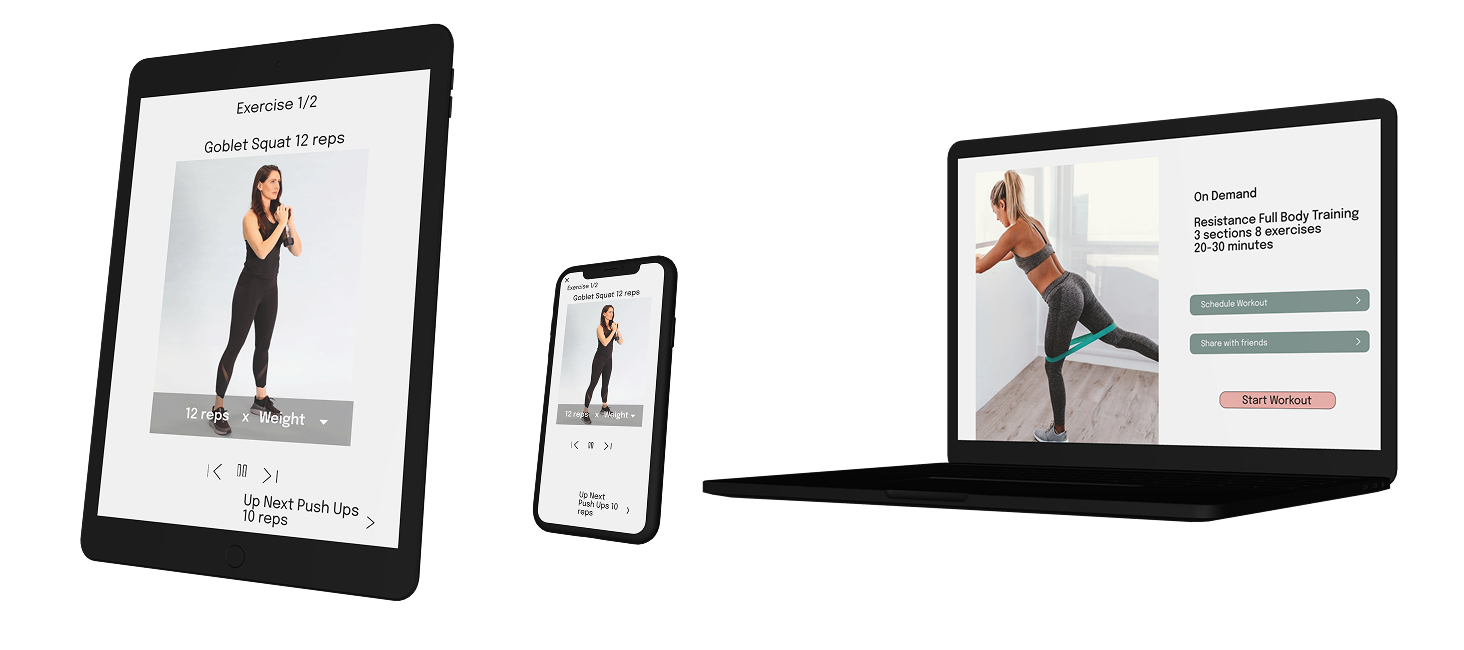
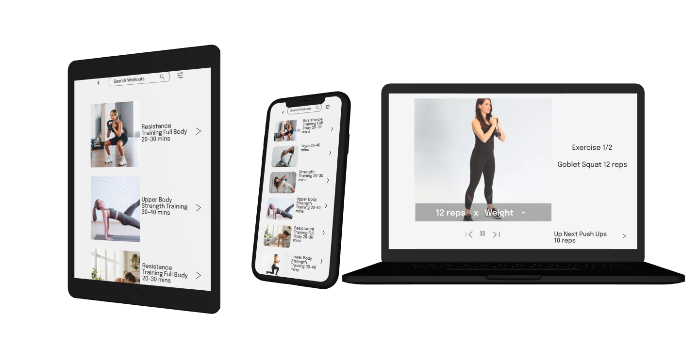
The design adapts smoothly across devices to support users like Rebecca, who switch between mobile, tablet and desktop.
Final Thoughts
Designing Build Up challenged me to think critically about how layout, visual hierarchy and responsiveness shape user confidence. This project helped me refine my ability to create clean UI systems across devices whilst staying intuitive and accessible.
Please do get in touch if you would like to connect . Here is my email sanjanaajwani2020@gmail.com