From user research to Product design from conception to visualization
Project Time
1 months
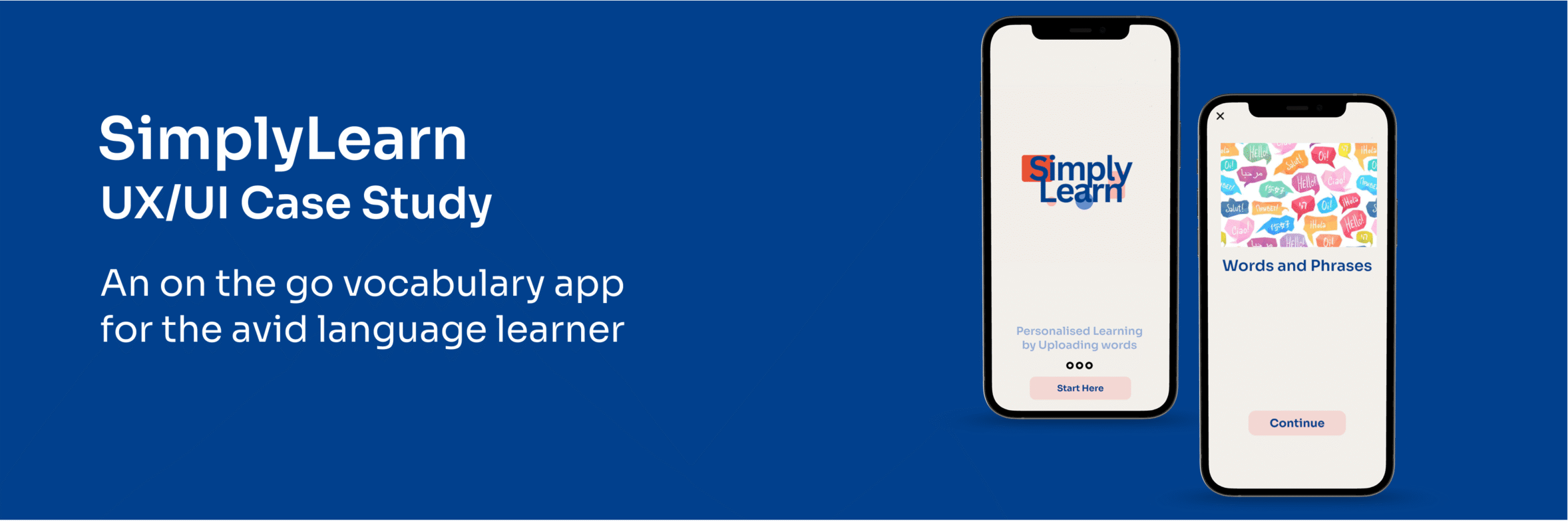
SimplyLearn is a vocabulary app which makes it easy for the avid learner to learn language vocabulary on the go. It is an essential tool for travellers who would like to learn to speak like a native whilst visiting new countries.
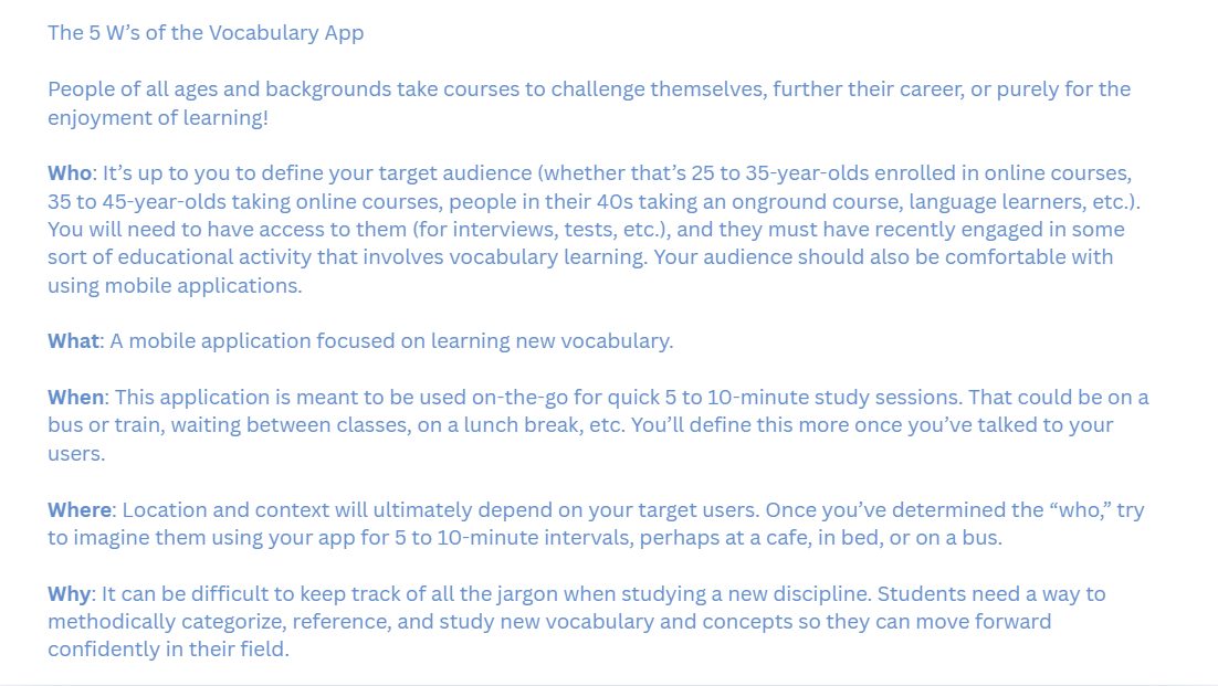
The Problem Statement
How might we design a mobile app that empowers people to learn new vocabulary?
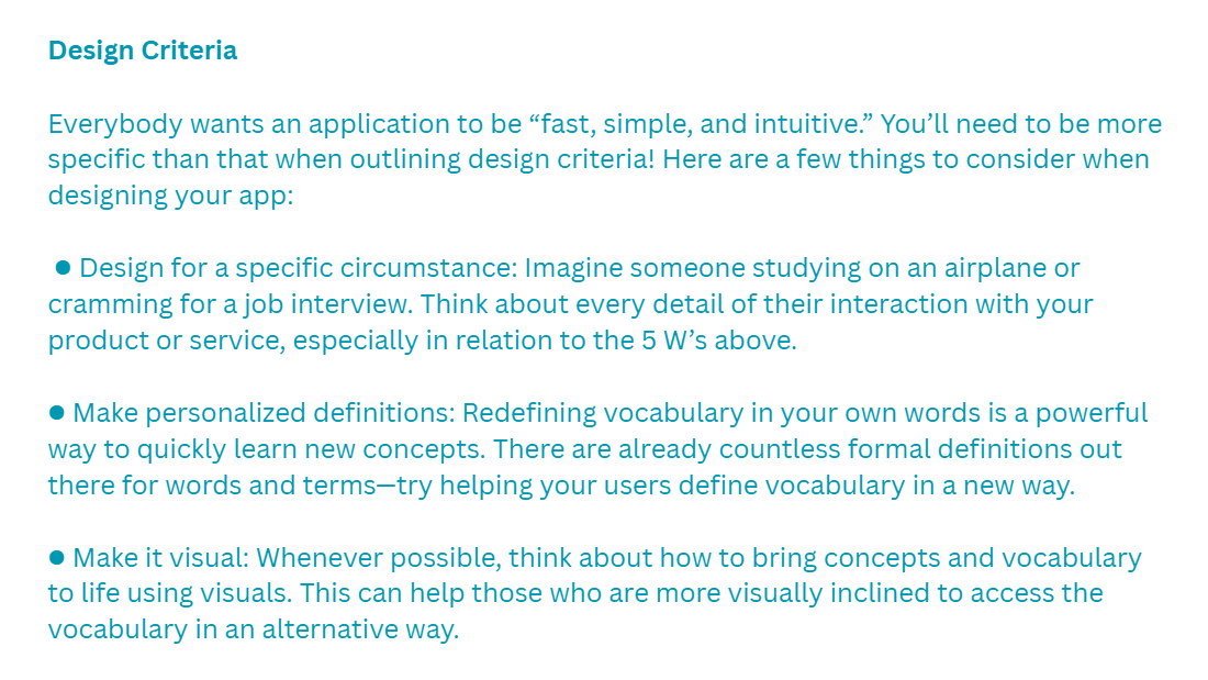
There was also a Design Criteria as below I had to follow for building the Vocabulary App.
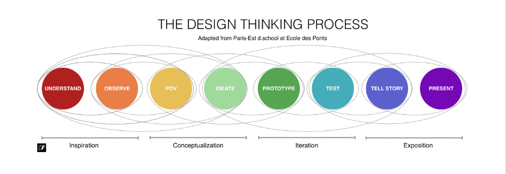
The design process that I followed is as below.
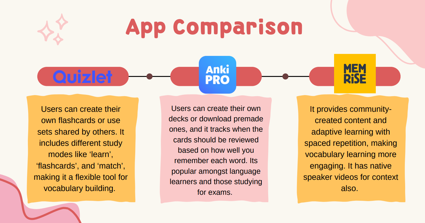
I started with Competitor Research of flashcard apps, which I wanted to familiarise myself with and see which features were popular amongst apps out there. The three apps which I went for were Quizlet, Anki Pro and Memrise. The app comparison is as below.
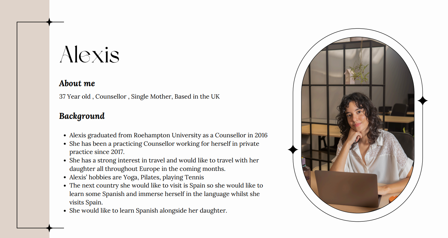
The next stage in the process was to think about the kind of users who would use the app and come up with the User Persona. The User Persona I decided upon for this app was Alexis. A 37-Year-old single mother who wanted to travel and learn on the go and immerse herself in Spanish terms so she could travel and eventually speak the language whilst visiting Spain.
Alexis’ Needs and Goals
Alexis wants to immerse herself with Spanish and want to talk to natives and other fellow learners on the app. She would like to travel to Spain and still be able to learn Spanish and integrate her travels with learning on the app.
Alexis’ Behaviours
Alexis wants to learn Spanish in her own time and wants to learn on the go as she has a lot of commitments and her private practice to manage. She wants to learn on her Smartphone while travelling with her daughter to Spain.
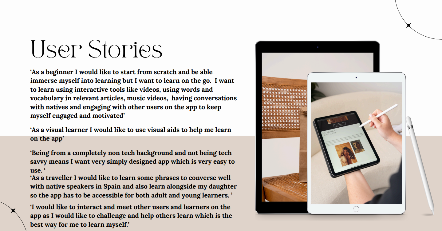
The User Stories for Alexis was the next in the process and which determined the UI in the end for the app.
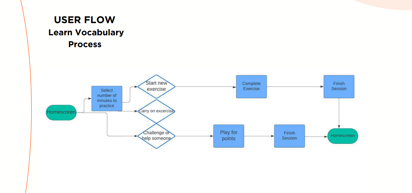
The next stage in the process was drawing up user flows in line with the User Stories. The user flow for the vocabulary learning is as below.
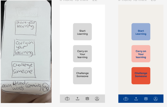
I then set about following the User Flows to make low fidelity paper wireframes and a prototype of the app. Here is the link for the low fidelity prototype Link
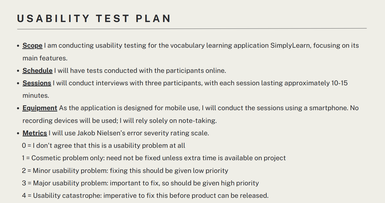
The next stage in the process was to do some usability testing and test the paper prototype with real users and I set about writing up a usability test plan and carrying out the tests online with real participants. Here is the Usability Test Plan
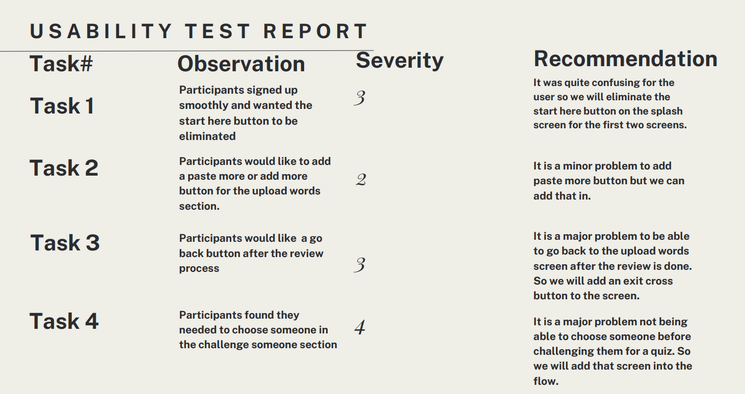
The Usability Test Report is as follows.
I also iterated on my paper prototype and added the recommendations to the final high fidelity mockup. I have added the choosing someone before challenging them for a quiz, and the eliminating the start here button on the two screens as is visible in the high fidelity prototype at the end of this case study.
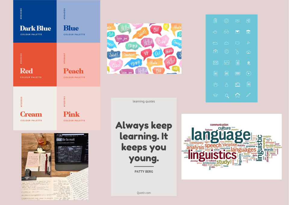
I drew up a mood board for the asthetic of the app and chose the icons, imagery and feel for the app.
This was not a requirement but I drew up some high fidelity mockups for the vocabulary app and here is the process from low fideility wireframes to mid fidelity to high fidelity wireframes as below.
The UI Prototype and high fidelity prototype Link here